21 Jan
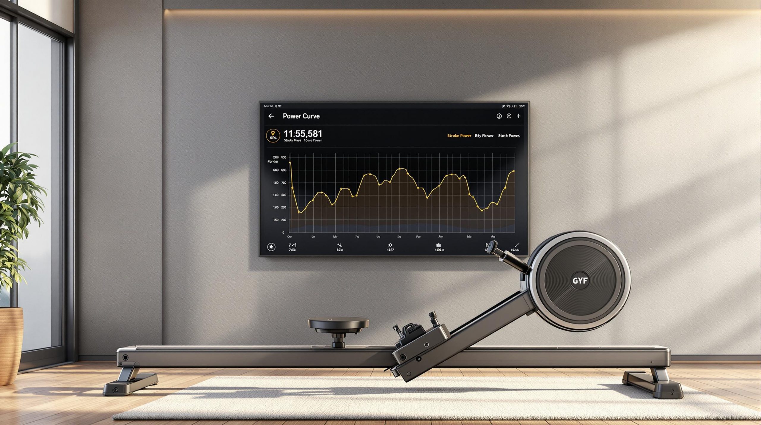
Power curves in indoor rowing display how force is applied throughout each stroke. A smooth, bell-shaped curve indicates efficient technique, while irregular shapes reveal issues like poor timing or uneven force distribution. Here’s why they matter:
- Spot Technical Issues: Identify flaws like rushing the catch or weak mid-drive coordination.
- Track Progress: Monitor stroke improvements over time using tools like Concept2 or ErgMonkey.
- Improve Training: Use real-time feedback to refine form and maximize efficiency.
Quick Tip: Aim for a smooth, consistent curve peaking mid-drive for optimal performance.
Power Curve 101 for the Concept 2 Indoor Rower
How to Read Power Curve Data
Power curve analysis is a key tool for refining your indoor rowing technique. By learning how to interpret these graphs, you can spot technical issues and improve your performance on machines like the Concept2 or RP3.
Common Power Curve Shapes
A smooth, bell-shaped curve signals consistent force application during the drive phase.
| Curve Shape | What It Means | Impact on Performance |
|---|---|---|
| Bell Curve | Balanced force application | Efficient and smooth stroke |
| Double Diamond | Too much force at the catch | Wasted energy |
| Flat Top | Sustained peak power | High efficiency |
| Sharp Peak | Uneven drive | Reduced stroke efficiency |
Ideal curves reflect good technique, while flawed ones highlight areas to work on.
What Flawed Power Curves Reveal
Flawed curves often point to specific technical problems. For example:
- Sharp peaks at the catch suggest rushing the drive phase, which wastes energy and increases injury risk.
- Valleys mid-drive indicate weak coordination between the legs and back, leading to a drop in power output.
- Multiple peaks show poor timing and coordination among the legs, back, and arms.
Each of these patterns suggests a need for better synchronization and control throughout the stroke.
Tips for Using Power Curve Data
Use power curves regularly to track your technique and performance. They can help you check for consistency, compare split times, and see how your form holds up during intense or varied workouts. This data is invaluable for fine-tuning your stroke and boosting overall results.
"Train to synchronize the peak forces of each rower to achieve maximum force at close to the same time, enhancing synergism and efficiency" [1].
Using Power Curves to Improve Training
Power curve analysis provides a clear way to fine-tune your rowing performance. By regularly examining these curves, you can make smarter decisions about your training and technique.
Monitoring Progress Over Time
Reviewing power curves consistently can reveal important details about your rowing progress. Tools like ErgMonkey offer features to help you track performance trends and pinpoint areas in your technique that need attention.
| Monitoring Period | Focus Areas | Key Actions |
|---|---|---|
| Short-Term | Curve consistency and power distribution | Check form and force application |
| Long-Term | Technical growth | Track changes in curve shape and efficiency |
The area under the curve reflects how well you’re applying power. A larger curve generally means you’re distributing force more effectively throughout the stroke.
But looking at the data is just the beginning – what really matters is how you use it to adjust your training.
Adjusting Training Based on Power Curves
If your power curve highlights a technical issue, focus your training on fixing it. For example, a steep rise at the start of the curve might suggest poor force application during the catch. To address this, you could:
- Work on catch positioning drills
- Practice applying steady, controlled power throughout the stroke
"A fuller power curve is more efficient than one that is high but narrow."
Real-time feedback during training can also help you refine your technique. When analyzing your curves, pay attention to:
- Force Application: Aim for smooth transitions between stroke phases.
- Power Distribution: Keep your force consistent during the drive.
- Efficiency: Work to smooth out any irregularities in the curve.
With tools like Concept2 or ErgMonkey, tracking and interpreting your power curve data becomes much easier, helping you spot areas to improve and measure your progress effectively.
sbb-itb-1725142
Tools for Analyzing Power Curves
Modern tools now give rowers detailed insights into their power curve data, helping them fine-tune their technique and improve performance. These platforms turn raw numbers into meaningful training information.
Features of ErgMonkey

ErgMonkey focuses on breaking down power curve data to help rowers improve. Key features include:
- Tracking power curve trends over time
- Comparing performance across different workouts
- Analyzing technique for better efficiency
- Generating detailed performance reports
ErgMonkey works effortlessly with both Concept2 and RP3 machines, allowing rowers to keep a close eye on their technique and progress.
Using Concept2 and RP3 Data

Concept2 and RP3 machines each bring unique strengths to power curve analysis. Concept2 provides real-time force curve feedback during workouts, while RP3 offers stroke-by-stroke consistency tracking, complete with an ideal parabola to guide technique.
When paired with analysis tools like ErgMonkey, these machines can help rowers focus on:
Technical Analysis: Both machines break down how force is applied during different phases of the stroke, making it easier to spot areas that need work [2].
Performance Tracking: ErgMonkey uses data from both machines to:
- Monitor technique improvements over time
- Compare the efficiency of different workouts
- Study patterns in power output across sessions
Conclusion
Key Takeaways
Power curves play a crucial role in evaluating indoor rowing performance by offering instant visual feedback on stroke mechanics. The curve’s shape and size reveal how effectively you apply force during different phases of the stroke, helping you pinpoint areas that need work and monitor your progress.
This isn’t just about crunching numbers – it’s about refining your rowing technique and reaching optimal performance. Consistent and smooth force application is the foundation of effective rowing. As highlighted earlier:
"A large, full area under the impulse curve will be more powerful and efficient than a high but narrow triangular shape over the same time period, with the result being a higher average boat velocity going into the recovery portion of the stroke cycle." [1]
Next Steps
To make the most of power curves:
- Use the power curve display on your rowing machine during every session.
- Track your progress and fine-tune your technique with tools like ErgMonkey.
- Prioritize maintaining proper form while gradually increasing your power output.
Power curves are equally important for team training, helping crews align their power output for improved efficiency [1]. This combination of individual technique improvement and team synchronization makes power curve analysis a powerful tool for any rower or team.
FAQs
Here are answers to some common questions about power curves and how they relate to rowing performance.
What does an ideal power curve look like?
An ideal power curve is smooth and peaks in the middle, showing efficient force application throughout the stroke. This shape indicates proper sequencing of effort from the catch to the finish. To achieve this, focus on controlled transitions between the stroke phases.
What is the power graph on a rowing machine?
The power graph, seen on machines like the Concept2, shows how force is applied in real time. It tracks how your legs, back, and arms contribute to power. A larger, smoother curve usually means better technique and lower split times. By studying the graph during workouts, you can refine your technique to improve force distribution.
What makes a good power curve on the erg?
A good power curve is smooth and bell-shaped, with the peak occurring mid-drive. It should gradually build from the catch and taper off cleanly at the finish. This shape reflects proper muscle engagement and efficient power transfer. Irregular shapes, like "peaks and valleys" or "double diamond" patterns, often point to technique issues, such as uneven transitions between the legs, back, and arms during the drive.